Tips for Choosing Calm Colors to Create a Relaxing Home
Creating a serene, peaceful atmosphere in your home starts with the colors you choose. Calm colors can transform any space into a relaxing retreat, helping to reduce stress and improve your mood. But with so many shades available, how do you pick the right ones?
In this post, we’ll explore practical tips for choosing calm colors for your home. Whether you are repainting a single room or redesigning your entire space, these suggestions will help you find soothing colors that suit your style and lifestyle.
Why Choose Calm Colors?
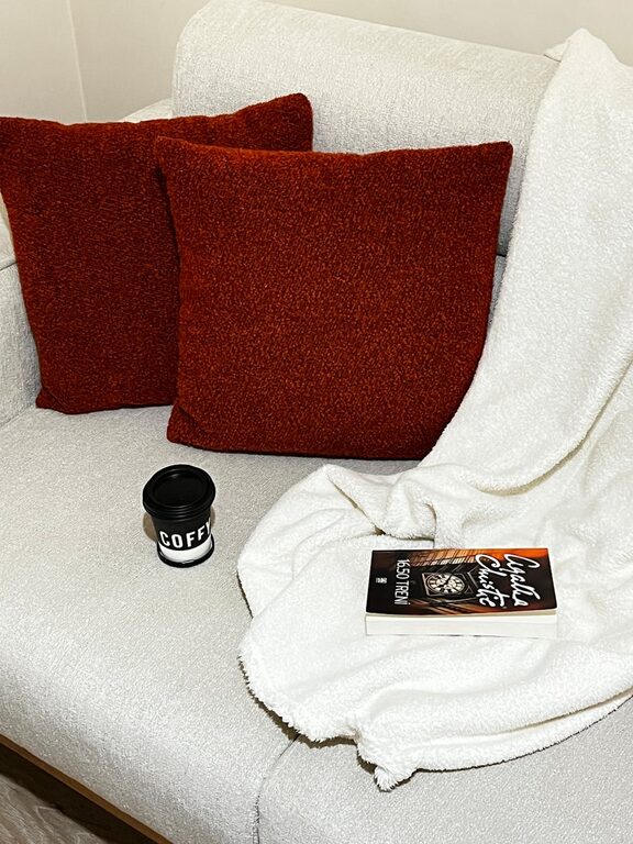
Calm colors typically include soft, muted shades that don’t overwhelm the senses. They promote relaxation, making them ideal for bedrooms, living rooms, or any space where you want to unwind. Some common calm colors are soft blues, gentle greens, warm neutrals, and pale lavenders.
Using calm colors can:
– Reduce feelings of anxiety and tension
– Promote better sleep and restfulness
– Create a welcoming and cozy environment
– Provide a timeless and versatile backdrop for your décor
Understanding Color Psychology
Before selecting your colors, it helps to understand a bit about how colors affect feelings:
– Blue: Often associated with tranquility and trust, it’s great for calming minds.
– Green: Evokes nature and balance, encouraging relaxation.
– Neutral tones: Beige, taupe, and soft grays provide understated calmness.
– Lavender and soft purples: Known for their soothing and peaceful effect.
– Soft pinks: Add warmth and comfort without being overwhelming.
Avoid bright or overly saturated hues if your goal is calmness, as these can energize rather than soothe.
Tips for Choosing Calm Colors
1. Consider the Purpose of Each Room
Think about how you use the space. Bedrooms benefit from relaxing tones like soft blues or greens. Living rooms can handle more warm neutrals to encourage connection and comfort. Bathrooms with pale blues or sandy shades make for spa-like retreats.
2. Test Colors in Different Lighting
Colors can appear differently depending on natural and artificial light. Test paint samples on your walls and observe them at different times of day. This helps ensure that your chosen calm shade stays soothing in all lighting conditions.
3. Use a Soft, Muted Palette
Opt for pastel or toned-down versions of colors rather than bright ones. For example, instead of bold turquoise, choose a pale aqua. Instead of vivid yellow, consider a warm cream.
4. Pair Calm Colors with Neutral Accents
To keep the color scheme balanced, combine calm shades with neutrals like white, beige, or soft gray. This helps create a harmonious look and keeps the space feeling light and open.
5. Incorporate Texture and Natural Materials
Colors interact with textures and materials. Soft textiles, wooden furniture, and natural fibers amplify the calming effect. For example, pairing a soft green wall with natural wood accents enhances the peaceful vibe.
6. Don’t Be Afraid of White
White and off-white shades can be incredibly calming when used thoughtfully. They provide a clean, open feel and work well as a base color that lets your calm accents shine.
7. Limit the Number of Colors
Stick to two or three main colors to avoid visual clutter. This approach promotes balance and ensures the space doesn’t feel busy.
8. Use Color Psychology to Your Advantage
If a certain calming color resonates with you personally, prioritize it. Your emotional response to color matters just as much as design trends.
Recommended Calm Color Palettes
Here are some sample color combinations to inspire your choices:
– Soft Blue + Light Gray + White: A classic, serene palette perfect for bedrooms.
– Sage Green + Warm Beige + Natural Wood: Creates an earthy, balanced feel.
– Lavender + Pale Gray + Cream: Elegant and restful, great for living rooms.
– Blush Pink + Soft Taupe + Off-White: Adds gentle warmth and comfort.
– Muted Aqua + Sand + White: Brings in coastal calmness, ideal for bathrooms.
Final Thoughts
Choosing calm colors for your home is a rewarding way to create a soothing, inviting space. By focusing on soft shades, paying attention to lighting, and using complementary textures, you can achieve a peaceful environment that suits your personal style.
Take your time experimenting with samples, and remember that calm colors don’t mean boring — they’re all about creating harmony and balance. Your home can become a tranquil retreat where you feel relaxed and refreshed every day.
—
Ready to start refreshing your walls? Gather some paint samples, take a deep breath, and enjoy the calming process of choosing the perfect colors for your home.